

Makers in the Making
When Makers in the Making approached us to develop their brand guidelines, the vision was clear: create a system that celebrates the art of making—by hand, with heart, and for everyone. As a platform that connects makers from diverse backgrounds—whether they’re preserving fruit, forging steel, or throwing clay—the brand needed to speak to a wide, intergenerational audience of down-to-earth creatives who value craft over convenience. The challenge was to design a cohesive visual identity and a component library that felt both flexible and familiar—designed for designers, but inspired by makers. Every element, from the typography to the imagery, was rooted in the concept of being hands-on, emphasizing the tactile nature of the work and the makers behind it. This case study explores how we translated that spirit into a scalable, intuitive brand system that feels as handmade as the crafts it supports.

Discovery
Research
To create a brand that truly reflected the heart of Makers in the Making, I began with in-depth research into our diverse, hands-on audience and the broader maker landscape.
Color Palette
From this, I developed a tactile, grounded aesthetic—selecting earthy, welcoming tones like cream, sage green
(for food craft), terracotta orange (for craftsmanship), and dusty purple (for artistry), each with 20% tints and shades
for versatility.
This calm palette stands in contrast to the bold urgency seen in competing brands, instead encouraging users to slow down and take pride in the process.
Typography
For typography, I paired the historical elegance of Roma with the clean modernity of Julius Sans One, and rounded it out with Ivy Soft Variable for warmth and flexibility across headings and body copy.

Sketches / Wireframes
With a clear sense of the brand’s identity and visual direction, I transitioned into the sketching phase—keeping things loose, iterative, and grounded in function. I began with rough wireframes to explore layout possibilities and ensure that every element of the brand would have its place. These early sketches weren’t just about structure—they were about storytelling, making space for the brand’s values to come through visually.
To further visualize how the brand might live beyond the guidelines, I also created tentative sketches of what an app could look like when built with this system. These concept sketches served two purposes: they helped shape the initial component set, and they gave early insight into how the brand’s personality could carry through in digital product design. From button shapes to content blocks, everything was considered through the lens of simplicity, usability, and a distinctly hands-on aesthetic.


Implementation
The first round of creating the brand guideline came with its own set of challenges. As a designer, it was initially difficult to separate my own creative instincts from the needs of the guideline itself. I found myself thinking in terms of what I could design, rather than focusing on creating a tool that another designer could easily understand and build from.
My first iteration reflected that—visually interesting, but too open-ended. It allowed too much creative freedom without providing enough structure or clarity.
I realized that a successful brand guideline isn’t just a visual showcase—it’s a functional guide meant to align and direct.
To test its usability, I shared the guide with a fellow designer and asked them to create a simple "My Courses" page. The result surprised me—not because of their design choices, but because of what they revealed: gaps in my instructions, assumptions I’d made, and places where the system needed more clarity. That moment shifted my approach entirely—from creating for myself, to designing a guide that could empower any designer to work confidently within the brand.
*The design to the right was created after revisions


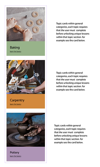
Component Library
To bring the Makers in the Making brand to life in a way that was both practical and expressive, I designed a full component library rooted in consistency, usability, and a deep sense of personality. These building blocks—ranging from buttons and cards to navigational elements and input fields—were crafted to reflect the tactile, grounded nature of the brand while being adaptable for designers of all levels to use with ease.
To make the system more engaging and memorable, I introduced a set of illustrated guiding hands—small visual elements woven throughout the interface to offer tips, highlight best practices, or simply provide a bit of fun. These illustrations added warmth to the experience and served as subtle reminders of the brand’s hands-on ethos.
Additionally, I created celebratory banners designed to recognize milestones and achievements within the platform. These worked as a lightweight reward system, encouraging users to keep creating and learning while reinforcing a sense of accomplishment. The banners—paired with the calming, earthy color palette—contributed to a brand experience that felt supportive, human, and proudly handmade.
The resulting component library wasn’t just a toolkit—it was a living expression of the brand’s core values, giving designers the structure they need and the inspiration they deserve.


Final Design
Learning from the initial experiment, I returned to the brand guideline with fresh eyes and a clearer objective: to build a system that didn’t just inspire creativity, but guided it with intention. I fine-tuned the layout, restructured the component explanations, and added clear, visual examples that demonstrated how each element should be used in practice.
Every page of the final guideline was created with another designer in mind—someone picking up the system for the first time, needing clarity, consistency, and confidence. From typography rules to component behavior, the updated guide struck a balance between flexibility and structure, giving just enough direction without stifling creative interpretation.
The result is a brand guideline that reflects the spirit of Makers in the Making—hands-on, grounded, and thoughtfully crafted—and one that equips designers to carry that spirit forward in every touchpoint they create.
View full prototype here


Reflections
This project challenged me to shift from thinking like a creator to thinking like a guide—to not just design for a brand, but to design a system others could use to keep that brand alive. Through research, sketching, testing, and refining, I learned the value of stepping back from personal design preferences in service of clarity, consistency, and collaboration.
What started as a brand guideline became a design experience in itself—one that celebrates the process of making just as much as the final outcome. By grounding every decision in the values of Makers in the Making, I was able to craft a toolkit that feels intuitive, expressive, and distinctly human. From hand-drawn notes to interactive components, every element speaks to the joy of working with your hands and the power of design to bring people together through craft.