

Sojourner Logo
Designing the logo for the Sojourner—a Bali 4.6 sailing catamaran set to circumnavigate the globe—was a challenge rooted in storytelling, symbolism, and personal meaning. Commissioned by a newly married couple embarking on the adventure of a lifetime, the goal was to create a set of logos that captured not just the vessel's name, but the values, dreams, and spirit behind their journey. Every element in the design was chosen with intention: the guiding stars representing faith, the dual circles symbolizing the world and their planned voyage, and nods to their love of nature, scuba diving, and their two beloved dogs, Waylon and June. More than just a logo, this design reflects a life of exploration, trust in the unknown, and a deep appreciation for the natural world—and each other.


Discovery
Moodboard
To kick off the design process, I created a moodboard that blended nautical elements with the client's requested symbolism. This included imagery of water and sailing, as well as visual references to their dogs, the cross, and the view from a boat—setting the tone for an adventurous and personal design direction.
Typography
The client initially hoped to use her mother’s handwritten script for the boat’s name, but due to a tight timeline and readability concerns, I sourced a close alternative. Snell Roundhand offered a similar style with improved legibility and multiple font weights. I paired it with Optima, a clean, versatile typeface that complemented the script beautifully. The client loved the combination, so no further exploration was needed.
Color
The client requested minimal use of color and trusted my judgment. I chose to work with ocean-inspired tones, exploring shades of teal and blue to evoke the spirit of the sea while keeping the overall palette calm and refined.
Discovery
Moodboard
To kick off the design process, I created a moodboard that blended nautical elements with the client's requested symbolism.
This included imagery of water and sailing, as well as visual references to their dogs, the cross, and the view from a boat—setting the tone for an adventurous and personal design direction.
Typography
The client initially hoped to use her mother’s handwritten script for the boat’s name, but due to a tight timeline and readability concerns, I sourced a close alternative. Snell Roundhand offered a similar style with improved legibility and multiple font weights. I paired it with Optima, a clean, versatile typeface that complemented the script beautifully. The client loved the combination, so no further exploration was needed.
Color
The client requested minimal use of color and trusted my judgment. I chose to work with ocean-inspired
tones, exploring shades of teal and blue to evoke the spirit of the sea while keeping the overall palette calm and refined.
Concept Sketches
1. Wave/Cross Design
This concept placed the boat front and center, with waves flowing beneath and a prominent cross element integrated to highlight the client’s faith. It was the most direct representation of their spiritual foundation, anchoring the logo in purpose and direction.
2. Reflection Design
In response to the client’s request for a more subtle spiritual reference, this version used three stars to represent the Holy Trinity—their guiding “North Star.” The boat floats above a mirrored reflection that incorporates mountain and tree silhouettes, tying in their love for nature while maintaining a calm, balanced composition.
3. One-Line Bay Scene
Inspired by the client’s appreciation for minimalist, one-line art, this design creates a serene bay scene. The boat is nestled in the water, surrounded by trees and mountains, with their two dogs—Waylon and June—waiting on shore. The three guiding stars are again present, subtly reinforcing their faith in a more abstract and artistic style.


1st Iterations
After initial feedback, I moved forward with refining two of the concepts for the first round of design iterations. The Type-Driven Expression direction was developed after this round, once it became clear that a more conceptual typographic solution could fill a unique space in the brand’s visual identity. These first two designs were adjusted for usability, tone, and audience resonance, and served as the foundation for further exploration.

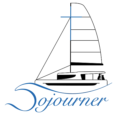


Final Design
The final logo became a meaningful blend of the first two concepts. The client loved the wave element from the Wave/Cross design, which cleverly forms the letter “S” in Sojourner. To integrate this into the Reflection concept, I added a second outer circle that connects seamlessly with the wave—tying the symbolic and structural elements together into one cohesive mark.
The direction of the boat was flipped to match the actual path of their upcoming journey. At the client’s last-minute request, scuba divers were added below the surface, along with their dog June, who is shown peering into the water—eagerly awaiting their return from the dive. We also refined the color palette, softening the teals into deeper, more bay-inspired blues that reflect one of their most anticipated destinations.


Reflections
This project was an extraordinary design opportunity, and I was honored to be chosen for it. Despite the challenge of a tight timeline and the depth of symbolism involved, I embraced the complexity and pushed myself with each iteration. Projects like this allow me to stretch creatively and showcase my design skills in a unique way. I’d love to take on more work like this in the future—where storytelling, symbolism, and design come together to create something truly personal.