

Texas Archive of the Moving Image
As part of a design team tasked with elevating the Texas Archive of the Moving Image (TAMI)'s presence at two key conferences, I contributed a set of original design concepts aimed at helping TAMI reimagine how they connect with their audiences. While the final selections were made through team voting and client input, the designs I pitched—ranging from roller banners to digital displays and social media assets—reflect my interpretation of TAMI’s evolving identity. These concepts sought to push the boundaries of how a film archive presents itself, honoring its historical roots while inviting fresh engagement through bold, unexpected visuals.


Discovery
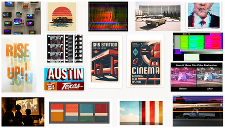
To kick off the project, I began by immersing myself in TAMI’s expansive archive, searching for visuals that captured the layered, timeless quality of Texas’s film heritage.
I looked for imagery that would evoke a sense of nostalgia across multiple generations—footage that didn’t just represent history, but felt alive with memory.
At the same time, I began building a moodboard, not as a final aesthetic solution, but as a tool to identify tonal direction and eliminate visual paths that didn’t resonate with the client’s evolving vision.
While the moodboard saw many iterations due to shifting feedback, it helped solidify which eras, textures, and film artifacts would best represent the breadth of the archive and the emotional connection TAMI hoped to spark in viewers.


Sketches / mockups
TCSS Conference – Educator-Focused Deliverables
For the educator-focused flier and roller banner, my sketches explored how to balance informative content with emotional storytelling. I played with ways to spotlight archival imagery in a way that felt inviting rather than academic—emphasizing headlines, quotes, and layered visuals that could appeal to both curiosity and nostalgia. I also considered how the roller banner could act as a standalone attention-grabber from across a busy conference floor, while still tying in with the flier’s narrative and tone.
Film Round-Up – Public Outreach Deliverables
The materials for the Film Round-Up leaned into a more community-driven and personal tone. My sketches for the rack card and digital assets revolved around creating a modular, scroll-like rhythm that mimicked storytelling—allowing for imagery, copy, and calls-to-action to flow together seamlessly. I sketched out animated transitions for the TV and iPad designs that could create visual interest without being overwhelming. For social media, I explored bold but friendly compositions that would feel shareable and familiar, all while integrating archival visuals in fresh, abstract ways


Final Design
TCSS Conference – Roller Banner & Flier
For the educator-facing materials, I designed a roller banner that felt bold and informative at a glance, featuring layered archival imagery and warm, grounded colors to evoke both trust and curiosity. The flier complemented this with more detailed messaging—highlighting TAMI’s educational resources, fellowship program, and call-to-action to join the email list. Both pieces focused on storytelling and accessibility, encouraging educators to see TAMI not just as an archive, but as a partner in the classroom.
Film Round-Up – Digital Assets & Social Media Covers
For the public-facing Film Round-Up, I designed digital TV/iPad graphics and social media cover photos that felt more nostalgic and communal. These designs leaned into timeless textures, sepia tones, and layered film visuals from the archive. The goal was to attract attention, stir personal memory, and invite people to contribute their own family films. The social banners were crafted to feel instantly familiar—like a memory you can’t quite place, but want to rediscover.
See prototype here


Reflections
This project taught me how to navigate complex client expectations while staying grounded in thoughtful design. Working as part of a team, I learned how to advocate for my creative ideas while remaining flexible through rounds of feedback and revision. It was especially rewarding to translate TAMI’s abstract goals—like evoking nostalgia without leaning on clichés—into visual assets that felt fresh yet familiar.
Although my designs weren’t ultimately selected, the process sharpened my ability to interpret brand needs, respond to shifting direction, and create work I’m proud of. It reinforced the importance of clear communication and reminded me that even unselected work has value when it contributes to a larger, shared vision.