
Moon Metro App
As lunar colonization and space tourism rapidly accelerate, the Moon is no longer just a dream destination—it's home to a growing community of residents and a hotspot for interstellar travelers. With an influx of commuters aged 25 to 50 heading to work as tour guides and a steady stream of tourists exploring lunar landmarks, the need for efficient, gravity-friendly transportation has skyrocketed. Traditional Earth vehicles simply don’t cut it on the Moon’s rugged terrain, but thanks to the rise of moon buses, the speed-of-light rail, and rover ride-shares, a new era of mobility is here. The Moon Metro app was developed to meet this moment—offering residents and workers a seamless, all-in-one platform to plan, book, and manage their inter-moon travel with ease.

Discovery
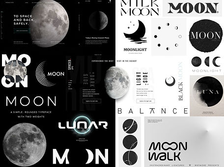
Mood board
I aimed for a high-contrast monochrome theme with a clean, space-age aesthetic—professional, modern, and inspired by the Moon’s stark environment.
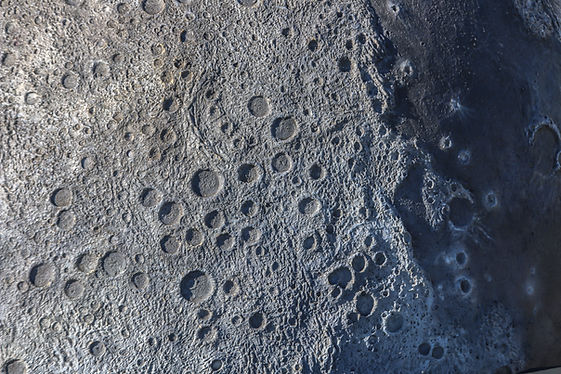
Color
Black and white reflect the Moon’s appearance against the dark sky. This limited palette was a creative challenge and reinforced the app’s minimalist tone.
Typography
I explored monospaced and sci-fi-inspired fonts for a futuristic feel, paired with clean sans-serifs to keep the design modern and easy to read.
BEBDBD
FFFFFF
000000
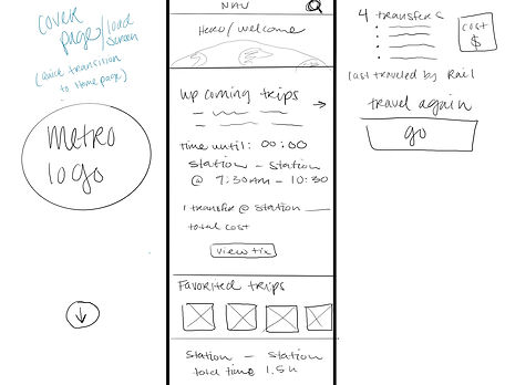
Sketches / Wireframes
Most of my sketches focused on layout and wire-framing. With a minimalist monochrome design, establishing visual hierarchy was key—so I explored ways to alternate black and white elements while keeping the interface cohesive and readable.
During this phase, I also imagined a playful interaction: the Moon rising as the app loads, setting the tone for an immersive lunar journey.


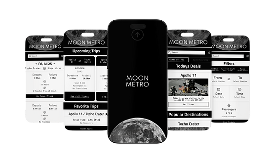
Final Design
Getting the spacing just right took some fine-tuning, but it was key to making the design feel clean and intuitive.
In the end, the app delivers a seamless experience—allowing users to quickly book transportation from recent trips, favorite routes, or popular destinations. With a simple search and filter system, finding a route is fast and
straightforward, and the entire booking process can be completed in just a few taps.
Reflections
One of the most rewarding parts of this project was taking on the challenge of designing within a monochrome palette—it pushed me to think more critically about layout, contrast, and hierarchy. I’m always excited by the opportunity to create app experiences that are not only easy to use but also visually engaging and fun to interact with.